terça-feira, 20 de maio de 2014
how to rock
How To Rock - 1ª Temporada Dublada RMVB
How To Rock - 1ª Temporada Dublada RMVB

Informações da Série
Título Original: How To Rock
Gênero: Comédia,Musical
Episódios: 26
Data de Lançamento: 2012
Direitos Autorais: Nickelodeon
Informações dos Arquivos
Tamanho: 60~70MB
Formato Original: RMVB
Duração: 23 Minutos
Resolução: 432X240
Qualidade: Boa
Idioma: Português BR
Legenda: S/L
Download
[RMVB] - MEGA
Download
[RMVB] - MEGA
Episódio 10 - Como Arrasar Na Mesa Do Almoço
Download
[RMVB] - MEGA
Episódio 11 - Como Arrasar na Festa de Aniversario
Download
[RMVB] - MEGA
Episódio 12 - Como Arrasar no Emprego
Download
[RMVB] - MEGA
Episódio 15 - Como Arrasar Com Uma Canção de Amor
Download
[RMVB] - MEGA
Episódio 16-17 - Como Arrasar com uma Grande Chance (Parte 1 e 2)
Download
[RMVB] - MEGA
Episódio 18 - Como Arrasar No Anuario
Download
[RMVB] - MEGA
Episódio 19 - Como Arrasar Sendo a Sensação do Colégio
Download
Episódio 21 - Como Arrasar Acampando
Download
[RMVB] - MEGA
Episódio 22 - Como Arrasar com Uma Vitima da Moda
Download
[RMVB] - MEGA
Episódio 23 - Como Arrasar de Uniformes
Download
[RMVB] - MEGA
Episódio 24 - Como Arrasar com a Bola de Tênis
Download
terça-feira, 11 de fevereiro de 2014


2ª Temporada Dublada
1 - Eu o vi primeiro - Assistir Online
2 - Fase da intervenção - Assistir Online
3 - Eu te devo- Assistir Online
4 - Eu machuquei o Lewbert - Assistir Online
5 - Icarly no Japão - Assistir Online
6 - Loucos por tortas - Assistir Online
7 - Vida nova no Natal - Assistir Online
8 - Primeiro beijo - Assistir Online
9 - Quem quer ganhar um carro - Assistir Online
10 - Acabei com a votação - Assistir Online
11 - Fred está morto - Assistir Online
12 - O plano perfeito - Assistir Online
13 - Preciso do meu website de volta - Assistir Online
14 - Transormando a Sam - Assistir Online
15 - O gerador nuclear - Assistir Online
16 -Meu namorado bad boy - Assistir Online
17 - O encontro com Missy - Assistir Online
18 - Contra a Dingo - Assistir Online
19 - Preciso do armário 239 - Assistir Online
20 - Gêmeas - Assistir Online
21 - Enfrentando a Shelby Marx - Assistir Online
quarta-feira, 5 de fevereiro de 2014
Whatever this says about me I am going to go ahead and say it regardless: Nickelodeon was a big part of my upbringing, childhood and overall initial exposure to the way of the American psyche. Growing up in Mexico City, we had a UFO-sized satellite dish atop our house that grabbed American channels, and among my favorite wasNickelodeon. It started with Double Dare and You can’t do that on Television — this, of course, meant slime, greener than any booger I could have ever picked from my young nose. Then, as a beginner teenager in the early 1990s cameRugrats, Doug and the transcendental Ren and Stimpy. There were also live action programs, but at the moment, those escape me. Needless to say, I was kid, and Nickelodeon was a channel for me. Over the years I moved on to MTV, Cinemax (ahem) and ESPN. I grew up and Nickelodeon wasn’t for me anymore. It hasn’t been for more than fifteen years I presume. And if you are reading this at your own free will, it means that it’s not for you anymore either. On top of all this, if you are, again, reading this it means you are aware of the recent introduction of a new Nickelodeon logothat usurped not just design blogs but mainstream pop culture ones that, in unison, mourned the metamorphosis-happy orange logo that now, as grown men and women, represents everything that is lame with kids today — a far cry from their own childhood.
Around that same time, I had urged everyone to take a chill pill and wait for the actual unveiling of the new identity across the different platforms before unleashing their nostalgic fury upon a limited view of the new wordmark. Well, today, September 28, is the day when Nickelodeon flips the switch on their identity and says good-bye to the iconic identity established in 1984 after Tom Corey — contracted by creative hothouse Fred/Alan — presented a bunch of logos and Fred Seibert asked if all the logos couldn’t be the logo. Fifteen years and approximately 1,000 versions later, Nickelodeon’s logo was anything from a rocket, to a cloud, to a wrench, to a range of free-form shapes. It was orange. Always. From these interpretations, the “splat” became the most ubiquitous and served to publicly represent Nickelodeon and its growing empire. “Growing” being key in the redesign of Nickelodeon.
Nickelodeon today is not The Little Channel that Could of 30 years ago. It is a media enterprise that consists of multiple channels that air in 175 countries, a motion picture production company, themed environments, an ever-growing online presence, and purveyors of numerous consumer products that kids can simply not have enough of on TV and must own physically. Add to this breadth of exposure that Nickelodeon has to appeal to a discerning and fluctuating audience that ranges from kindergarten kids to teens, without missing Nickelodeon’s core audience of kids 2 to 11 and you have a pretty complex brand. Was the “splat” logo able to work across all mediums, ventures, languages and ages? Nick didn’t think so, nor did their research, and this redesign presents the result of a process that started about three years ago as the company assessed its position in the market. To give us a little insight into what went on, I had the opportunity to talk with Russell Hicks, executive vice president and creative director at Nick.
Talking to Hicks the overarching sentiment — and one that has accompanies Nick all this time — is that of “Kids First.” Not you, or me. Kids. Like me, you probably enjoyed Ren and Stimpy. Your kids or those of your friends enjoyDora the Explorer. Their Nick is not your Nick. Neither you nor I grew up glued to the internet, kids today do. Kids first. This is not to say Nick has changed or its motives have changed, but kids today have. And, whether you like it or not, the “splat” and the 30-year-old identity had to change. To discover what this new identity could be, Hicks worked with his designers as well as design firms outside Nickelodeon. He provided a brief that outlined the different platforms (channels and divisions) in which the logo had to expand and adapt and challenged designers with three assignments and detailed how much energy they should spend on each one:
65% Take the “splat” idea and apply it to all platforms
30% Reinterpret the “splat”
5% Come up with something new
30% Reinterpret the “splat”
5% Come up with something new
As the work from within and from outside started rolling in, Hicks pushed everyone to make the “splat” work but, at such extent, it simply did not. From all these explorations, one solution pushed forward. A simple wordmark, created by Eric Zim — sorry, no link and no clue who he is — that Hicks and Nickelodeon felt could carry the load across ages, channels, mediums and ventures. When I first saw it, back in the glory days of Summer I immediately liked it. I thought, and still think, that it is very peculiar wordmark with a very strong presence. The counterforms are a little awkward, which generates some odd white color spots within the word. I like the lowercase “k” because it is well resolved from an uppercase shape. And, of course, the center of attention is the “i” with its tittle stretching high in the sky. I had the chance to get a sneak peek (non-publishable, sorry) at a reel of the on-air identity and the little dot brings everything together animating in different ways and being a key component in the behavior of the logo — if you sit around for an hour tonight, watching Nick and the rest of the channels you’ll get a glimpse. In the meantime, here are a few animations that we were able to get.
Click to Play
A few sample on-air animations. Apologies for the wordmark, my QuickTime is behaving badly.
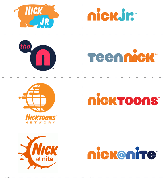
The “nick” from the main wordmark then serves to create the rest of channel identities, establishing a clear visual connection between all of them. To some this may come across as boring, but when you have hundreds of brand impressions at any given moment, you simply can not overlook the efficacy and efficiency of this method. But, above all, just how adorable is that “jr.” lettering? It’s rhetoric because it’s adorable.
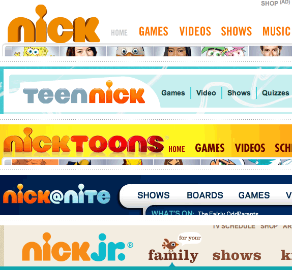
Crops from web headers.
One big disappointment for me so far, has been the execution of the logos online, with all of them — except for the adorable Nick Jr. — rendered with rather mundane dimension and shading. The effects don’t add anything to the identity and don’t give the wordmarks enough confidence to just let them be. Nonetheless, as the on-air applications indicate, this is an identity with a lot of potential and, if someone knows how to visually activate a brand, it’s Nickelodeon. So, sure, it’s not the Nickelodeon I grew up on but I’m sure my Dora-loving daughter couldn’t care less.

 Assista Sam e clipes de Gato
Nenhum comentário:
Postar um comentário